Fall Production Update
Welcome back, travelers, to another production update! We’ve been working hard to bring Forgotten Runiverse to life. Over the last month, the design, animation, and programming teams have been focused on laying the groundwork for the game’s core systems of combat, crafting, and building. The art team has also been hard at work adding new areas to the game like the Baobabs and Cuckooland and detailing the game’s user interface (UI).
Perhaps the most exciting item of note is that we’ve put together a fully working internal build that lets the team engage in the game’s core mechanics and start iteration on artwork and design to ensure the best experience possible in the final game. While this build is nowhere near ready for the public spotlight, it’s a valuable step in the right direction to getting something fully playable into your hands!
Combat Updates
The team has been making great strides in getting combat to a playable and enjoyable state with a fully fleshed out UI and game flow. You can learn a lot more about the plan for combat in our Combat Blog.

With the basic system working, we’ve begun building out content to increase the scope and variety for gameplay.
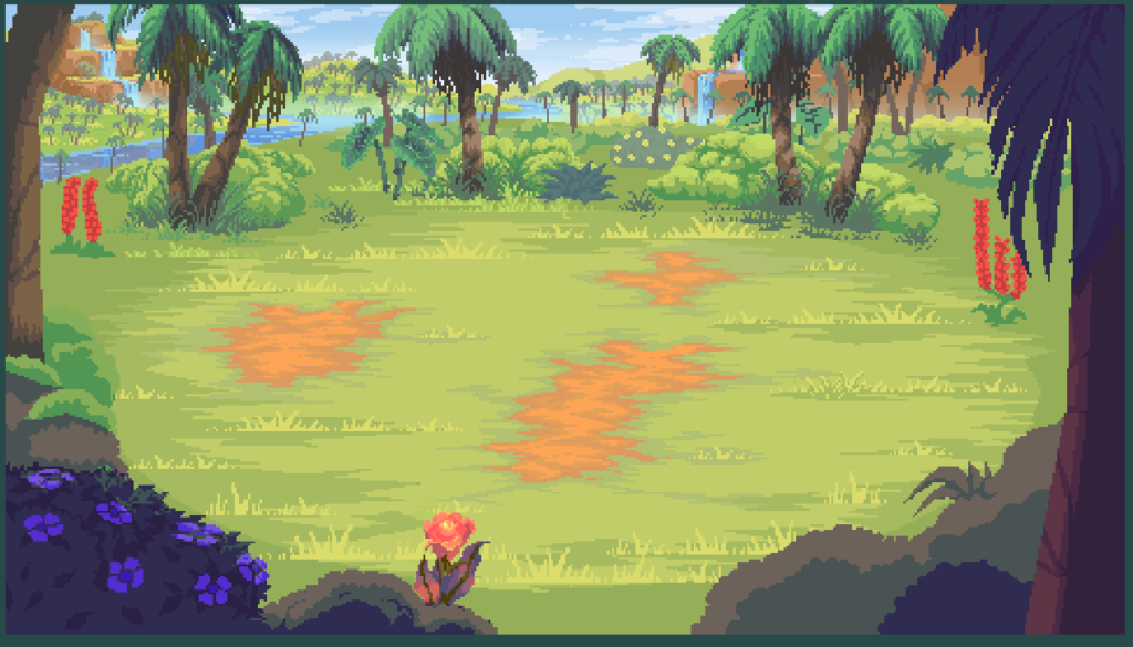
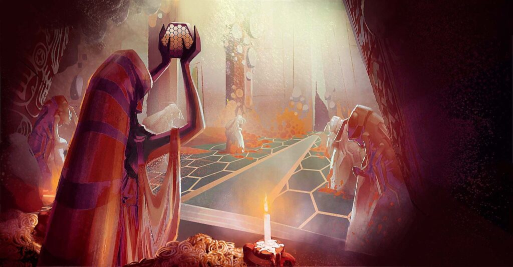
New Background Scenes and Dungeon Key Art
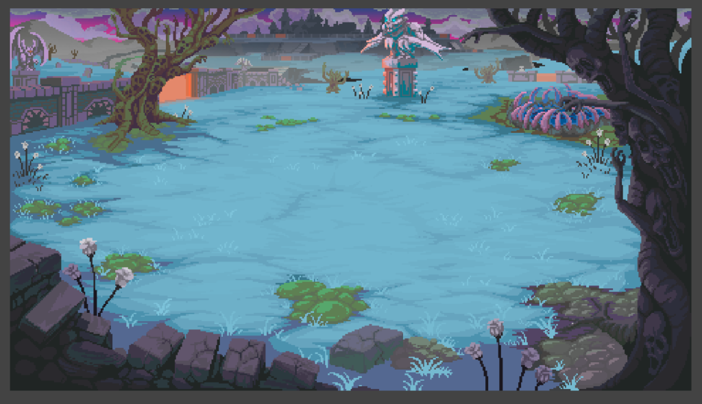
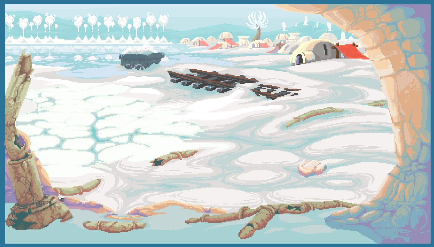
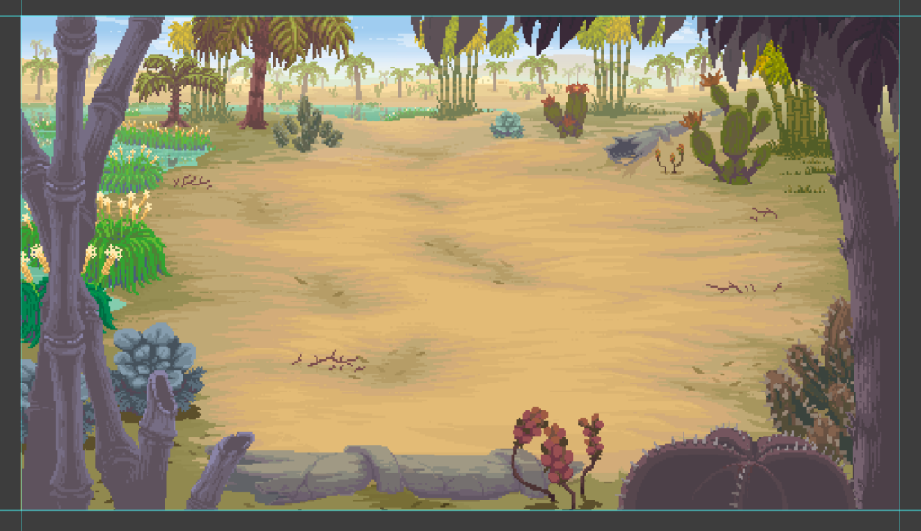
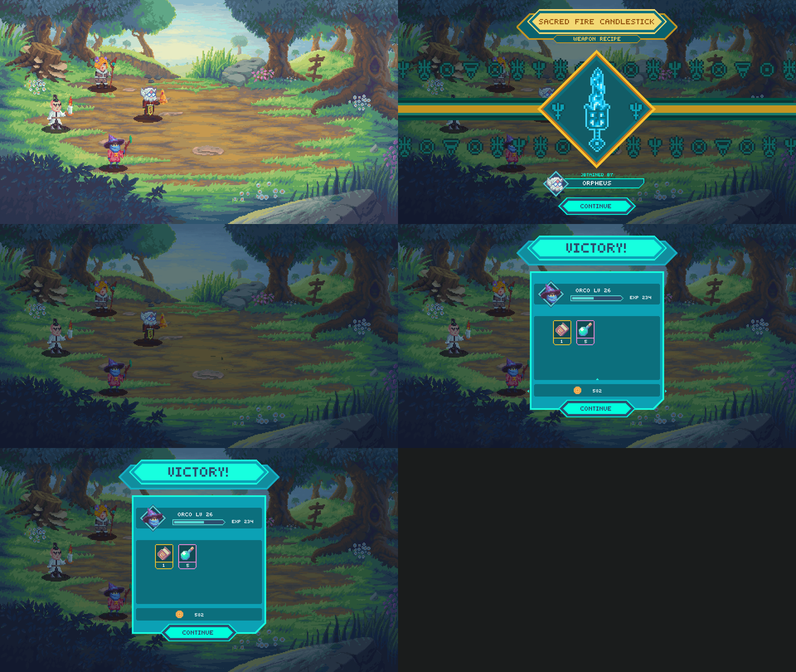
With the large variety of locations and biomes in the game, we also have to put together unique combat scenes for each region for you to slay in! Here’s a few of the latest ones that the team has been working on along with some concept art for Dungeons you’ll find within the world.

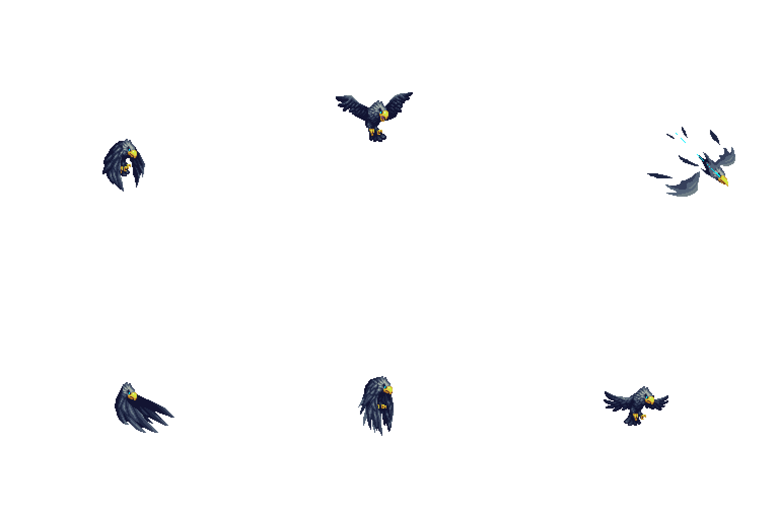
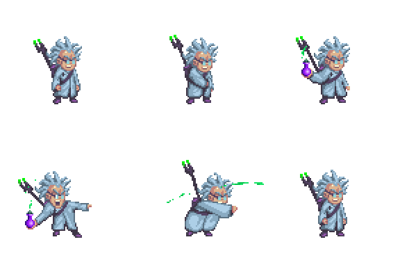
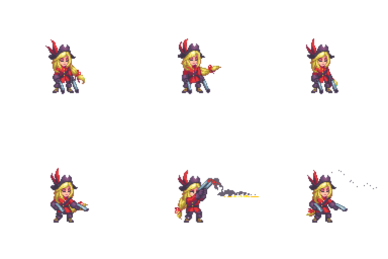
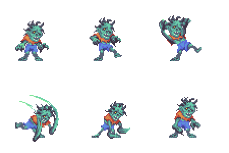
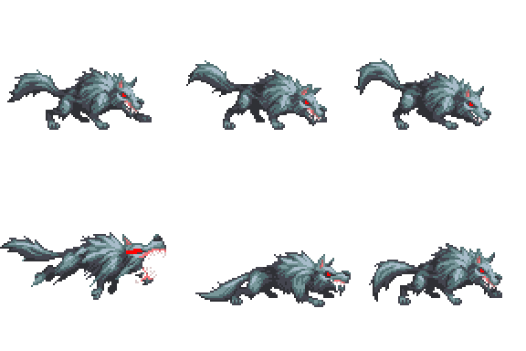
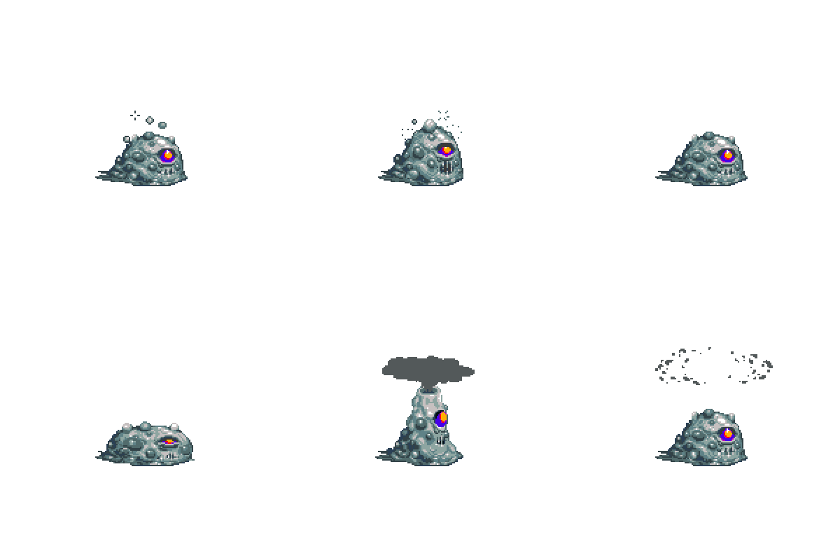
New Enemies
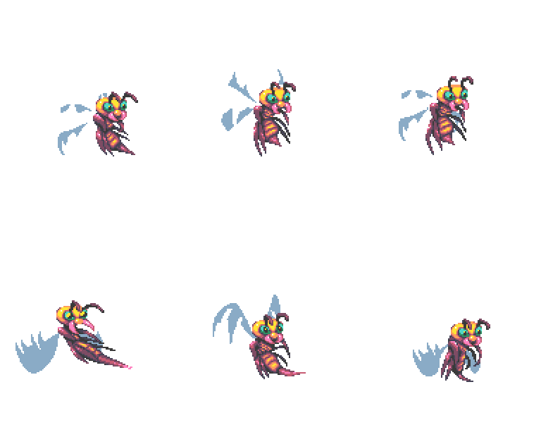
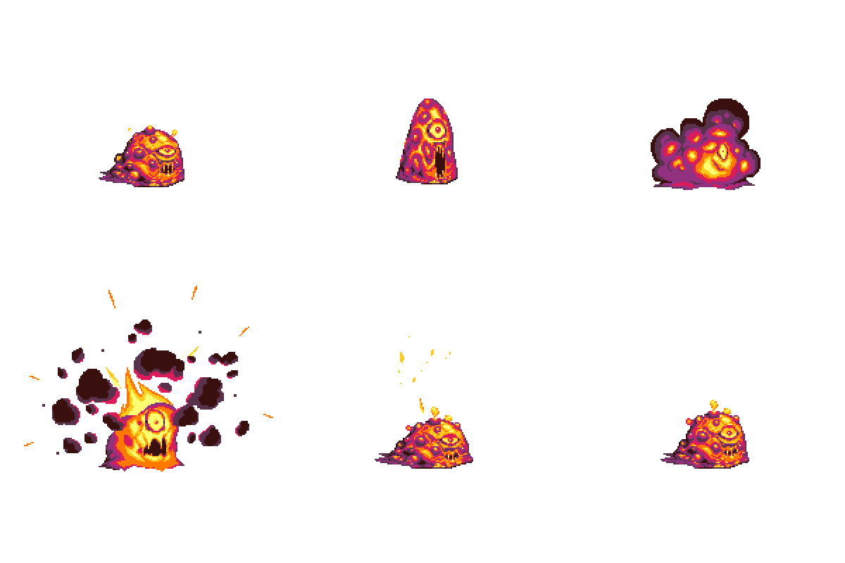
The team has been working to design unique enemies that will appear across the various biomes of the Runiverse. Once they’re designed, the animation team has the task of hand-animating their various attacks and reactions. It’s a lot of animation work, but should make the experience in the final game very rewarding.
UI Iterations
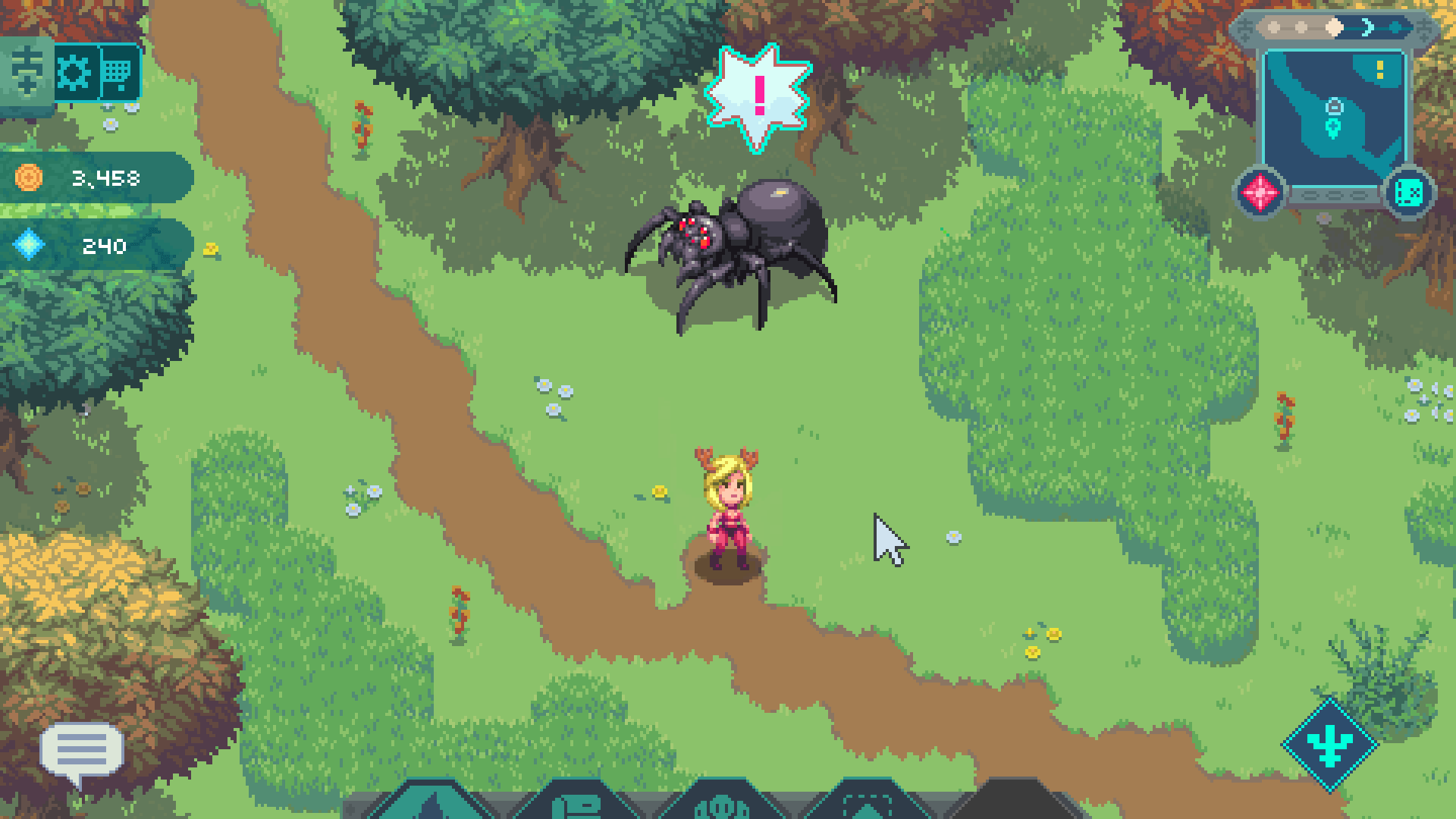
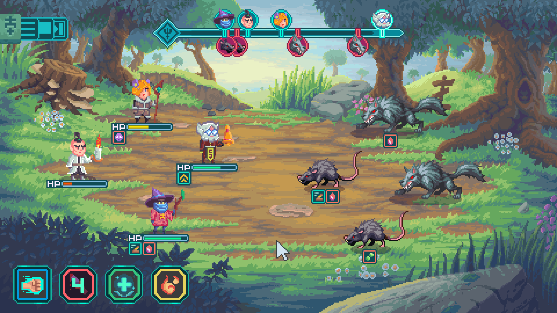
We’ve been iterating on the UI to communicate the info you need to know for combat. This will continue to get refined as we go through gameplay UX testing to ensure you’re getting the right information at each stage of combat – from before it begins, through to finding out what rewards you get for pummeling your foes.
Crafting Updates
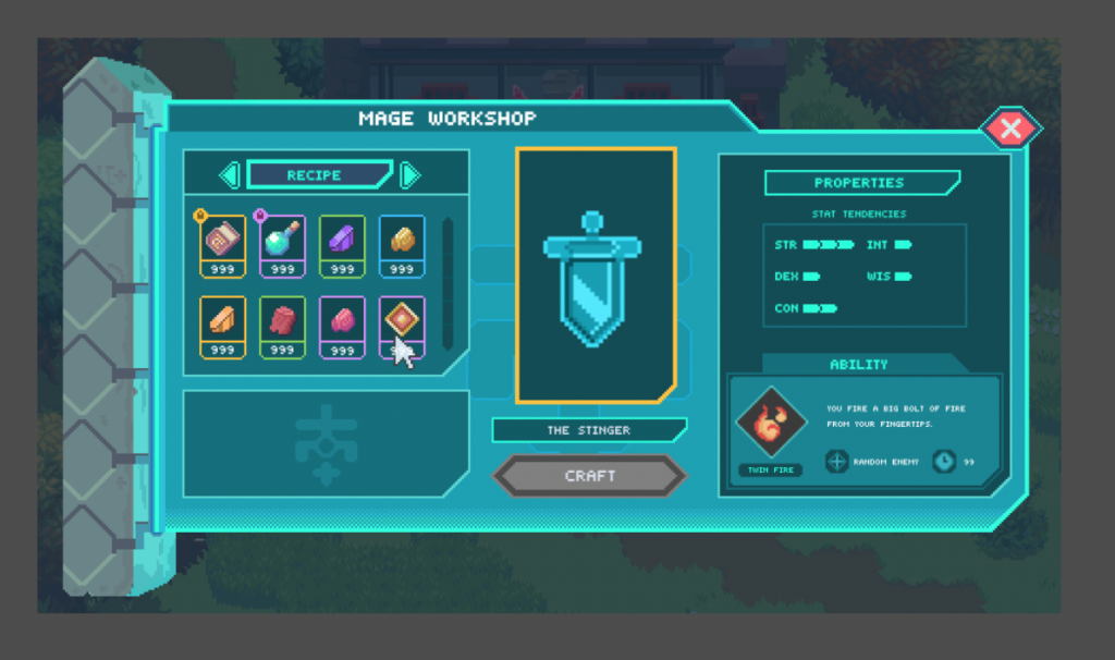
While combat is coming together, we’ve also been working diligently on the crafting system! We’ll have more details on exactly how this will work for you soon, but for now, here’s a look at some of the artwork and design systems we’ve been developing to make Crafting gameplay interesting, beautiful, and fun!
Locations
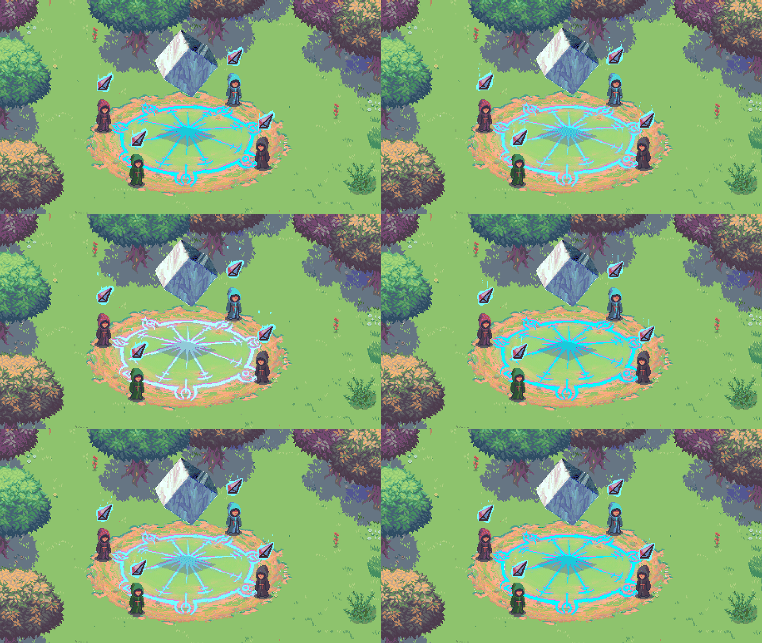
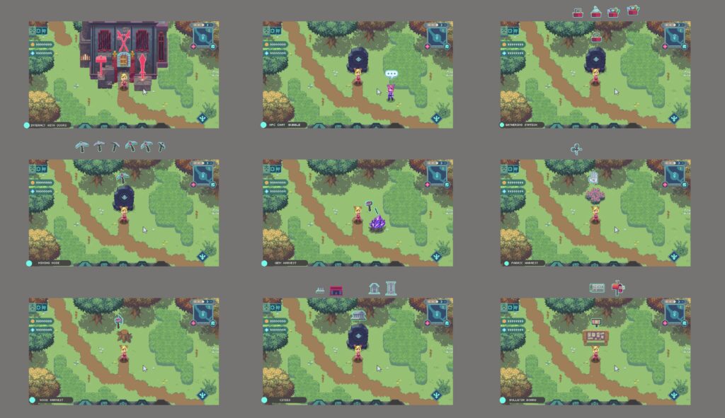
Gathering and Crafting happen at a variety of locations throughout the Runiverse. Some of these will be smaller gathering nodes, while others might be built locations such as a Forge. Regardless, the game will need to communicate important information like what is interactable, when you can take an action, and help to provide a mood or feeling from each location. Below, you can see a gathering location with a visual test to indicate your ability to gather from it. We’re creating a variety of icons and animations to clearly indicate the actions you can take throughout the game.
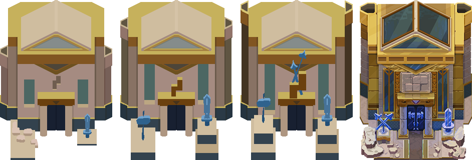
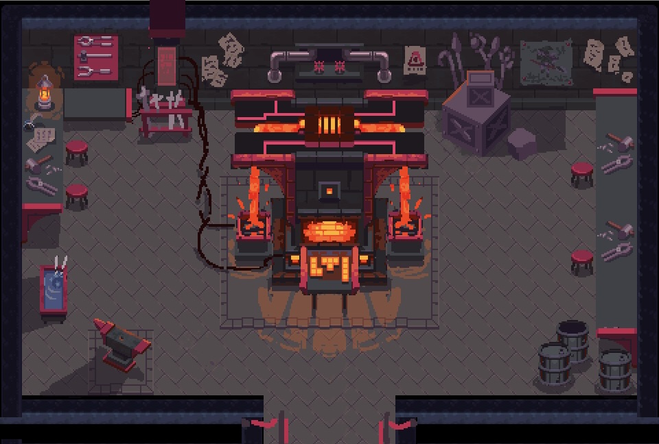
You may remember that each Wizard Capital will have its own design aesthetic, and their crafting buildings aren’t exempt from that. We’re building unique, upgradable versions of all the key buildings of the game to sit flawlessly inside their broader design sensibilities. You can see below some of the artwork going into the Forge – specifically for the Blue Wizards, along with an initial design for the interior of the Forge. We want each location to feel distinct, and ensure that the interaction and uses for it are clear through its visual design.
Crafting UI
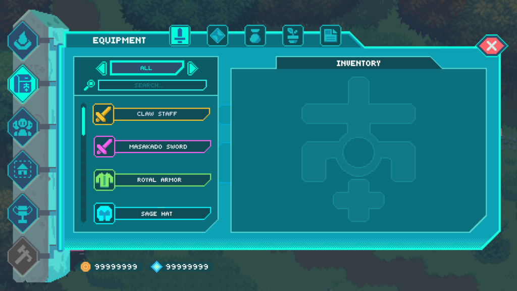
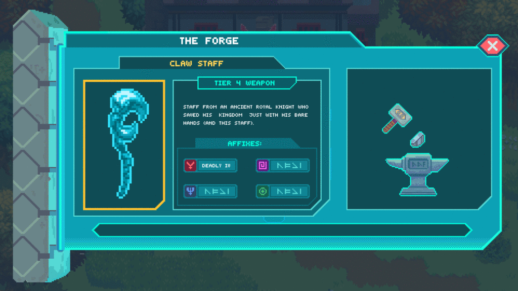
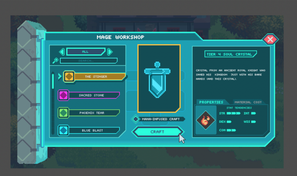
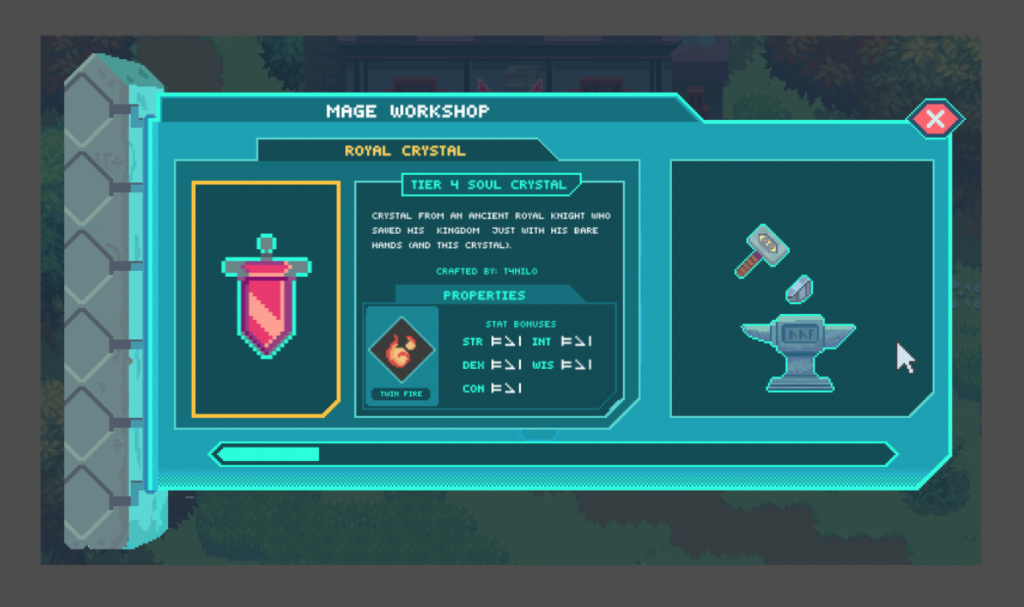
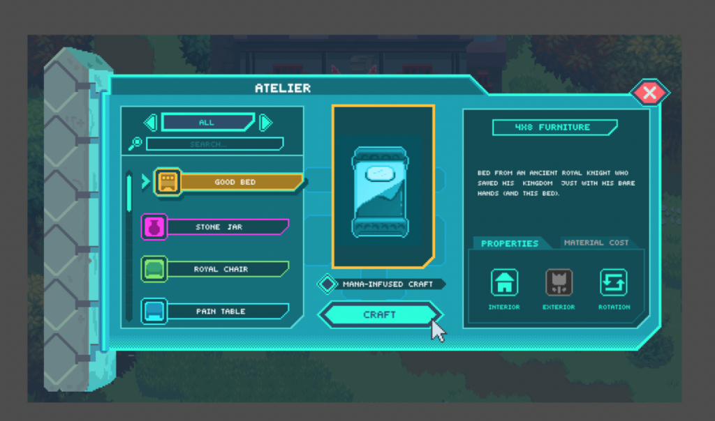
Crafting is a fairly complex process, with a ton of information that we need to convey to the player (you!). We’ve arrived at a working version of a comprehensive UI set that should be able to convey all the information you need in order to decide what to craft, determine the resources you need and currently have, as well as manage any items after they’ve been crafting.
Each item has a variety of information that you need to know about it from its cost to the benefits you’ll get, and how it will look. We’ll dive deeper into all of this in a Crafting deep dive in the near future.
Suffice to say, while conveying information is important, we’re still making a game so the art team is also always considering when they can add little touches of delight to the experience like a fun hammer hitting anvil animation in the Forge for example. At the end of the day, we’ve been successful if you’re able to easily make informed decisions about what and how to craft while experiencing a fun interaction with crafting so that even if you do it over and over again, you’ll feel satisfied and rewarded each time.
Party UI Tests
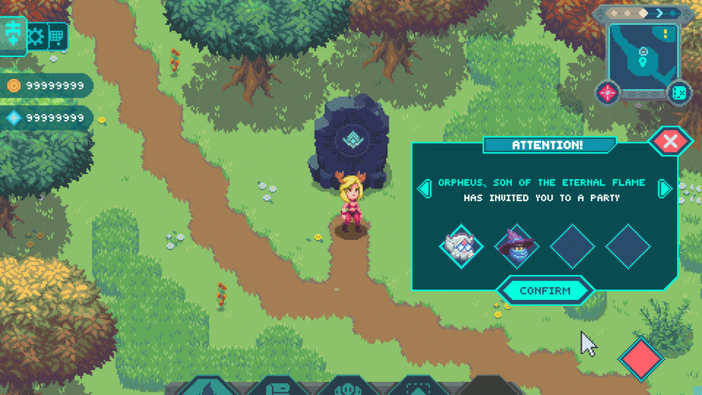
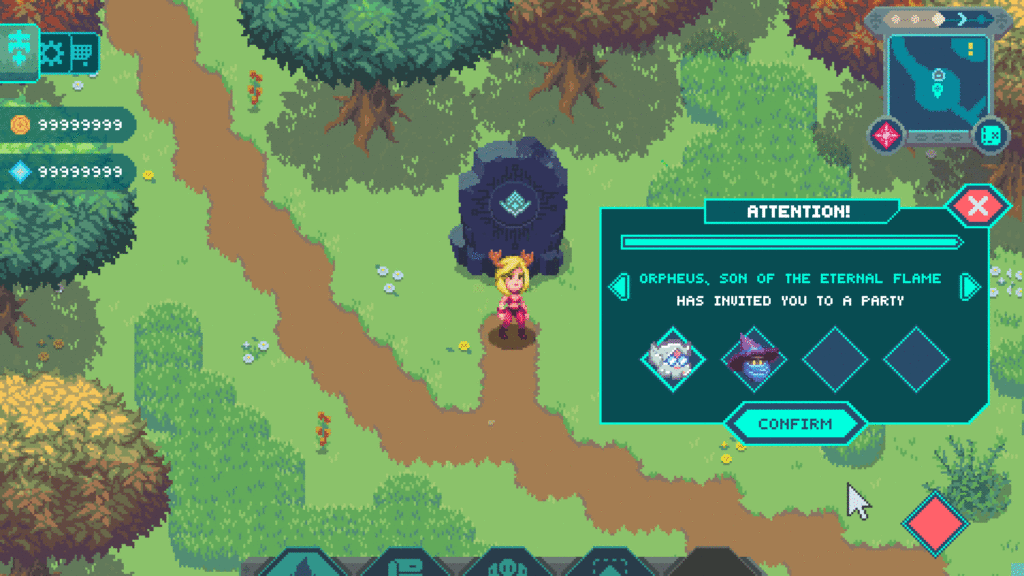
Playing with friends should be a seamless and fun experience in the Runiverse. With that in mind, we’ve started to work on the UI for parties – here are some of our most recent tests.
Environment Art and Level Design
With some of the art and animation team focused on UI and game interactions, we still have folks working on building out the rest of the world and ensuring that it’s going to be a magical experience to simply traverse the world and explore all of the regions of the Runiverse. In the last month or so, we’ve added a couple of new biomes and continued to build out the existing ones that we’ve shown you so far.
Cuckooland
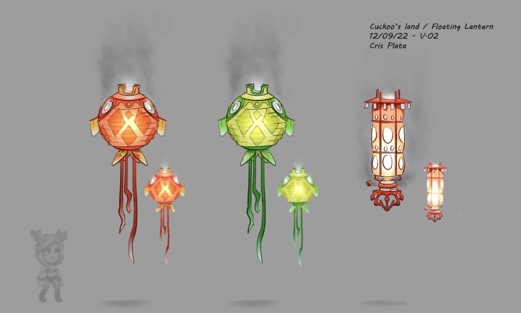
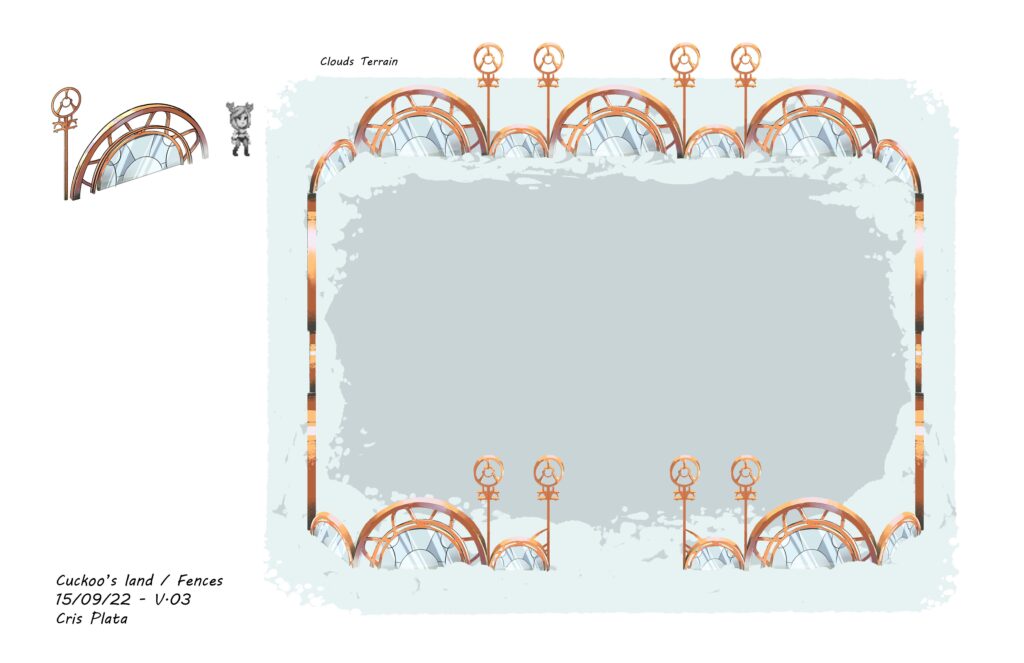
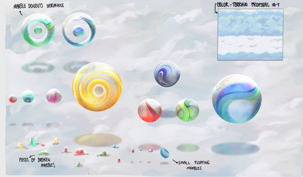
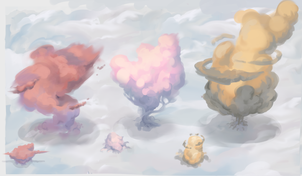
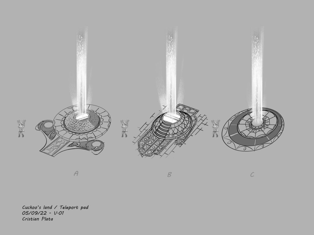
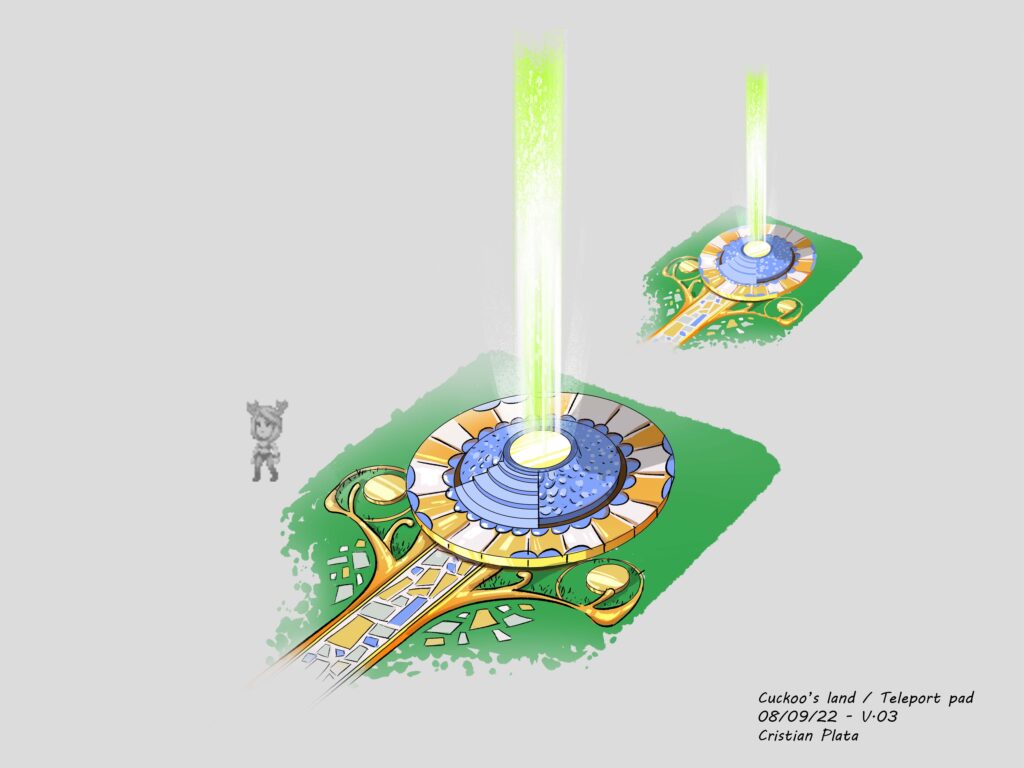
We’re excited to unveil a brand new landscape – one that floats up in the clouds. Cuckooland is unlike anything you’ve seen in the Runiverse thus far. It’s a magical place filled with all the colors of the rainbow, flying whales, and swirling fluffy trees.
In developing this area, we started with the colorful and imaginative regions from our concept artists’ minds. The concepts cover both the ideas for how the area’s civilization might reach even further into the sky, but also how things you’d be familiar with from the world like plants, animals, and bodies of water might be present in the region. From flying whales to hopscotch in the clouds to the rainbow bridge through the abyss we think this region is going to be pretty special to explore.
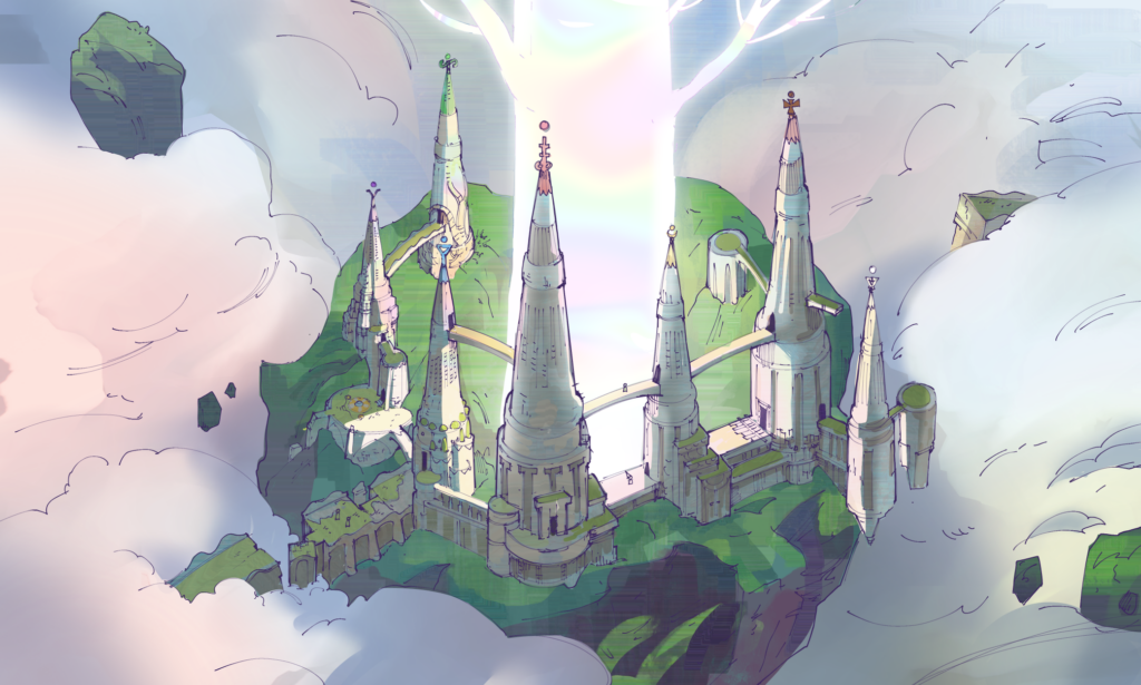
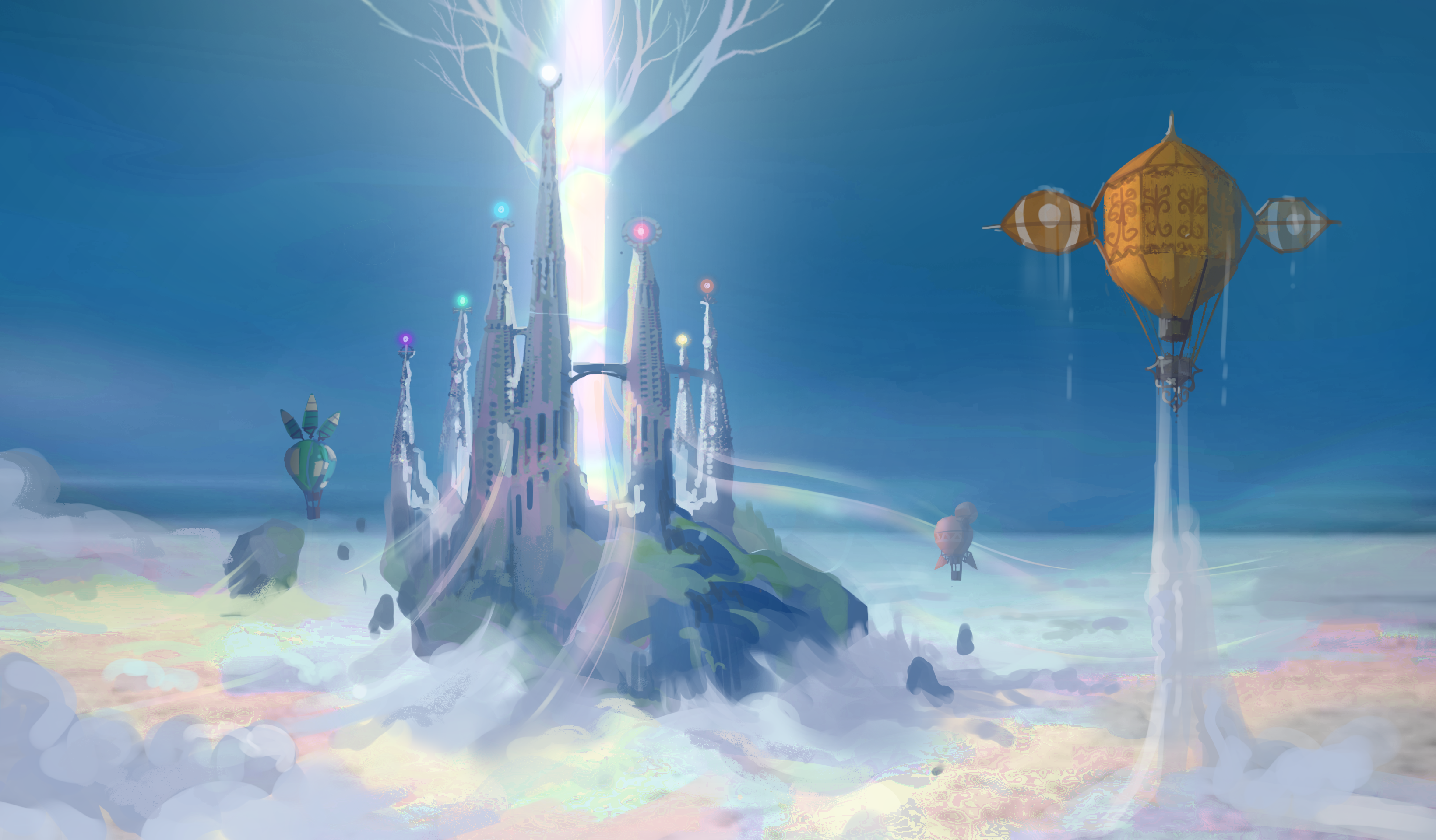

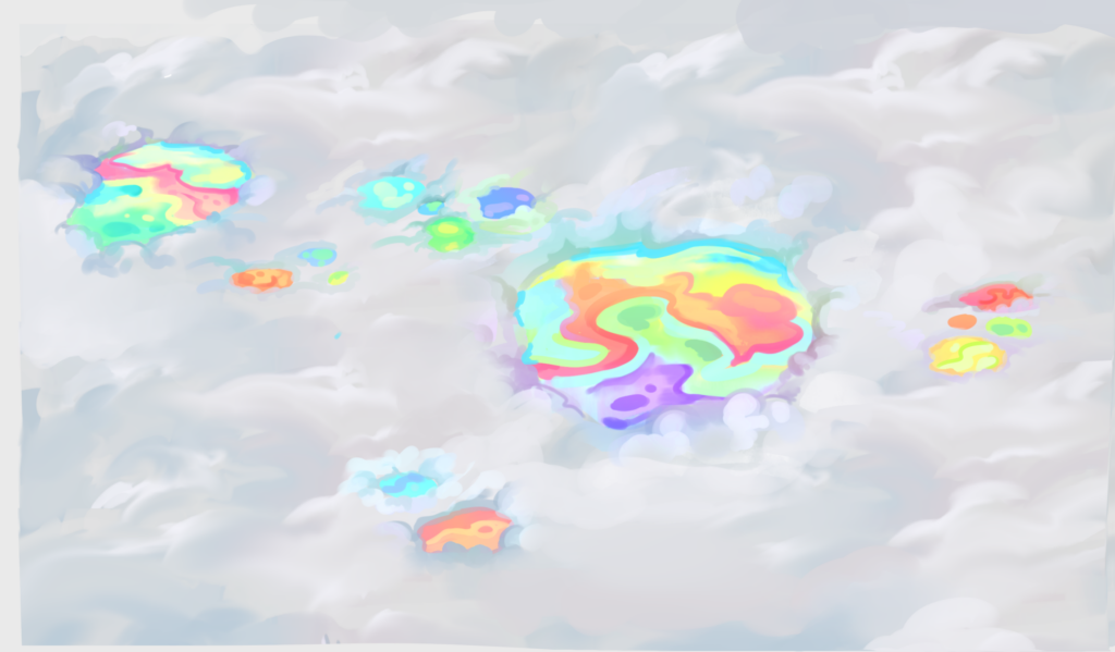
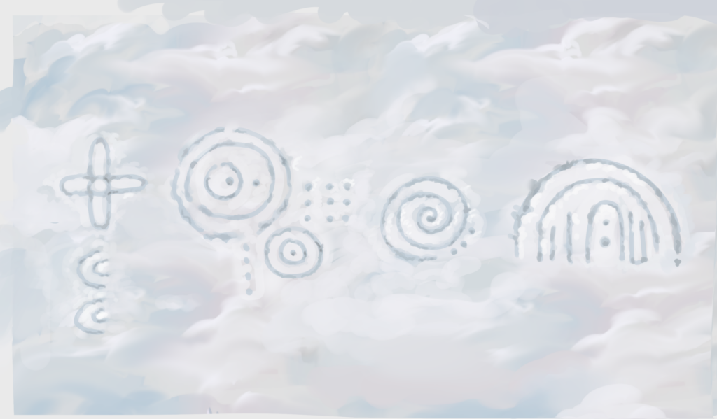
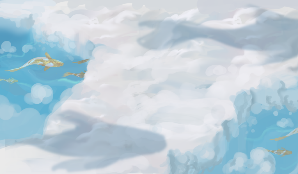
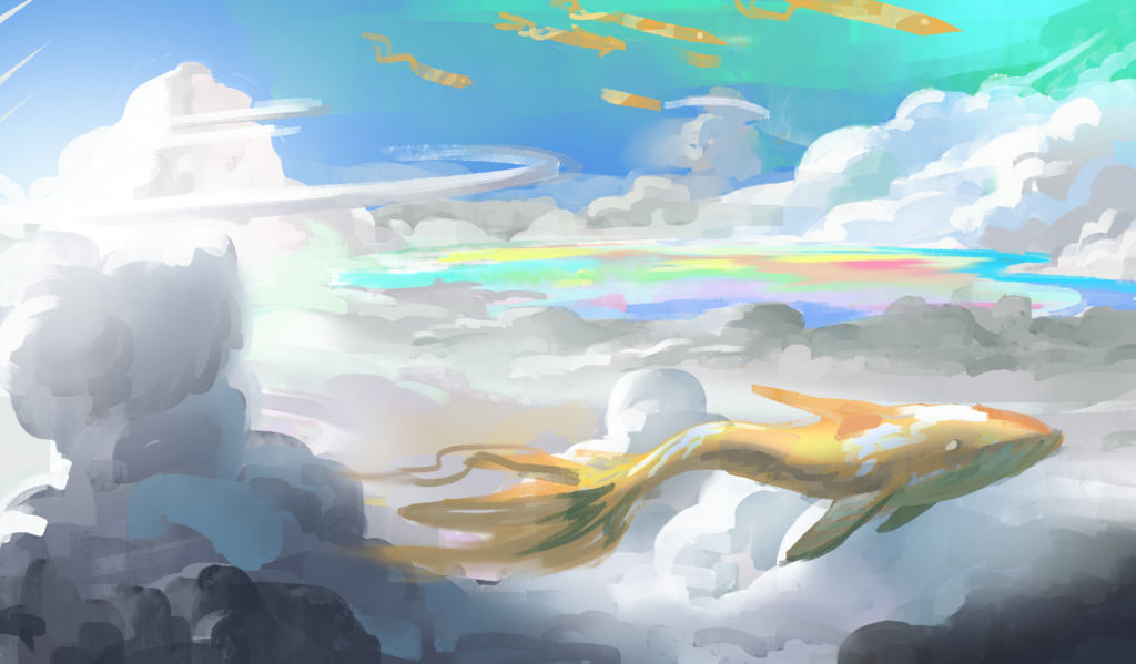
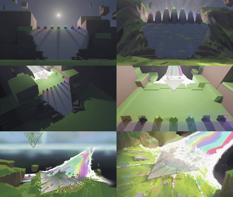
Beyond the larger scale concepts for the region, we’re also exploring how smaller touches and props can fit into the overall aesthetic while adding a unique feel to your explorations. Below, you can see some of the concepts for gates, guideposts like lanterns, and how even the trees of the region might transcend expectations.
Back Down to Earth
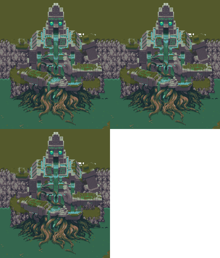
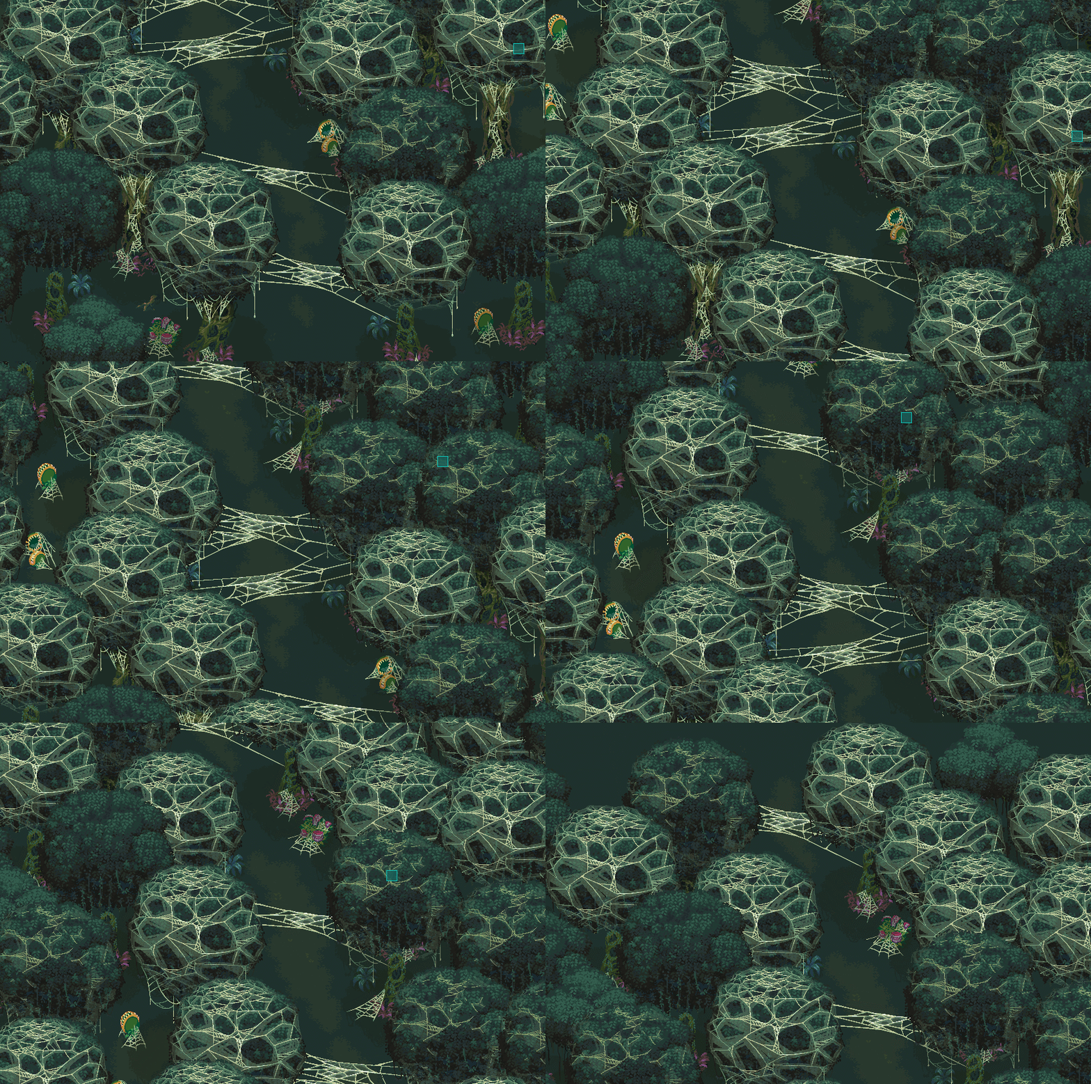
The Jungle and Savannah are two of the newer additions to the regions the team is developing, and the sheer biodiversity between them is giving the team the opportunity to explore some pretty interesting visuals. The spiderwebs of the Silk Undergrowth should be enough to give anyone creepy-crawlies, while the massive scale of The Rooted Sanctuary in the Jungle may hint at even deeper secrets to uncover, and depths to plumb for treasure.
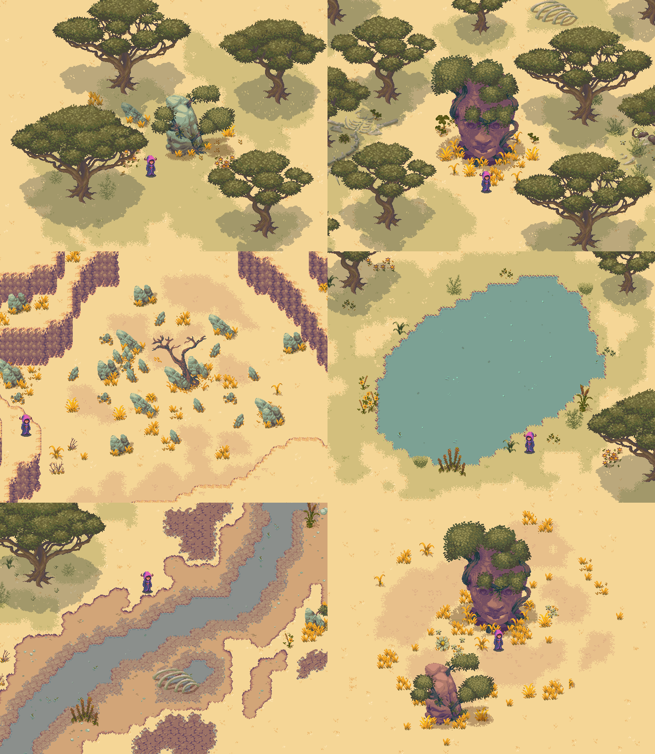
While the Jungle is typically known for its biodiversity, the Savannah has its own broad variety of experiences and places to experience and the environment art and level design teams have been working hard to build out that diversity with unique landmarks and places to explore as you can see below.
The Baobabs
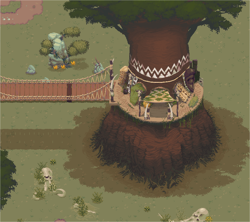
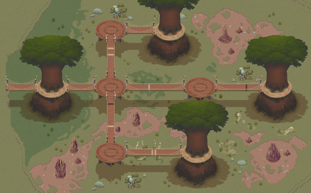
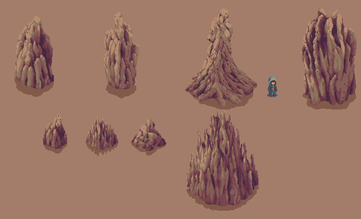
We love the Baobab forest! Check out these massive trees – they’ve got tons of character and all sorts of hidden pathways within them. Those massive mounds beside them were formed by termites – be careful where you step!
When we first created the Baobab Forest it was simply another forest made of towering trees. One of our team’s artists explored how the inhabitants might have changed their life if the ground level wasn’t quite so friendly, in this case because the native termites had mutated to be a little bigger and less friendly than the ones we generally know. With the ground becoming unsafe, the Boabab Forest now reflects how those people’s lives would have been uprooted as they were forced to live among the trees while bringing an architectural style and aesthetic inspired by ancient found relics and ruins with them.
The Red City
Each sect of Wizard has its own capital city and we’ve been working diligently the past few weeks on the red city. Check out some of the details you’ll find inside it.
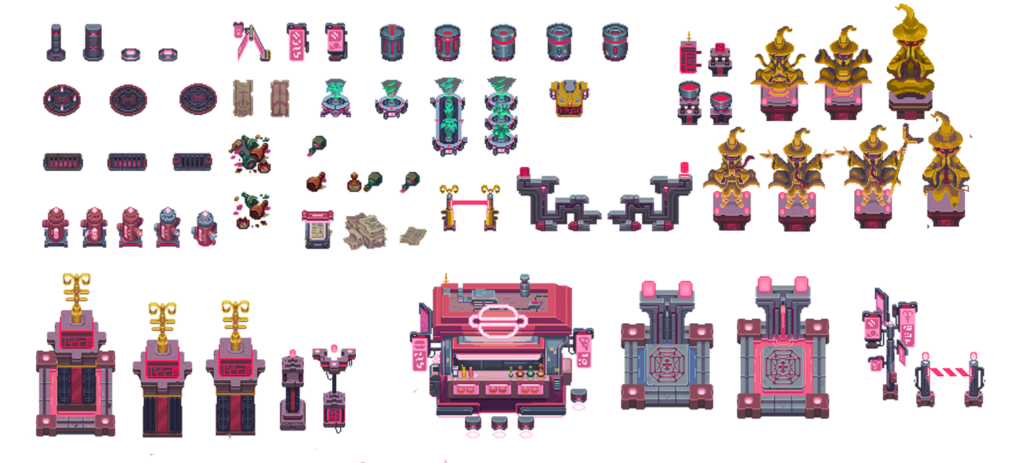
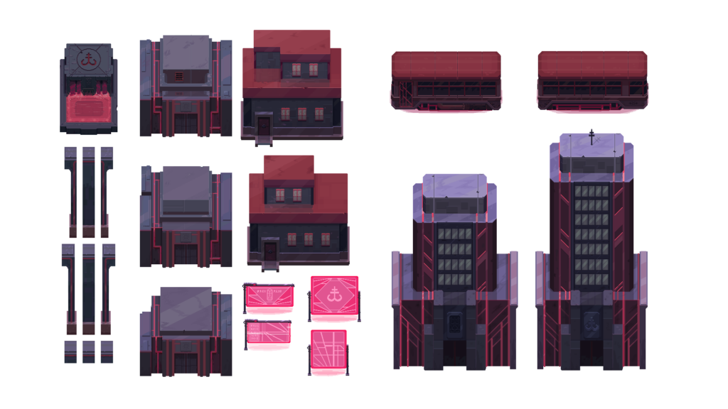
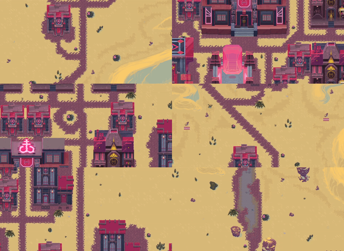
Below you can see a layout test to help see how important it will be to add all the defining details and decorations to an area for it to really come alive.
Character Selection
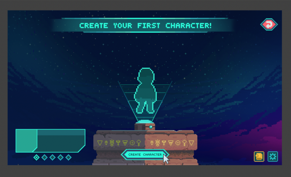
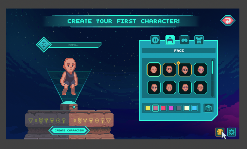
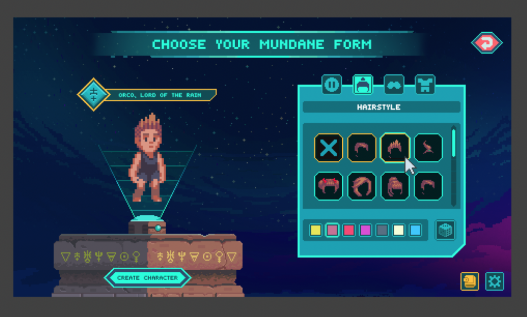
As we mentioned, we have a working build of the game for internal testing purposes, so we’ve also begun work on how you’ll make your very first interactions with the game – creating or importing a character! With the integration of NFT characters, we need to build a system that allows you to play as your unique NFT, but also to create and play as a different, more ‘mundane’ character to level up and explore with. We’ll be continuing to iterate and ensure.

Music
On the audio side of things, we’ve been focusing on music and themes for certain regions and are starting to work on sound effects for the game. It’s pretty fun to see how each region of the world has its own score that goes along with it. Here are a few samples that you might hear in the game:


