Spring Production Update
Wow, 2023 has been flying past! With spring here we’re excited to give you an update on some of the progress we’ve made with Forgotten Runiverse! In this post we’ll give an update on our UX Tests, game production from art to programming, and finally game design and the progress on our game whitepaper.
Art Updates
The big focus for the team these last few months has been producing content at scale. We’ve refined the pipeline for battle scenes to allow the team to begin producing them for every region and landmark location of the game. The decoration system has also begun coming together so we’ve been producing a variety of objects and landmarks to decorate the world, personal plots and buildings with.
We’ve also been focusing on cities, polishing up battler settings, enemies, and VFX for both enemies and player spells and abilities.
Cities
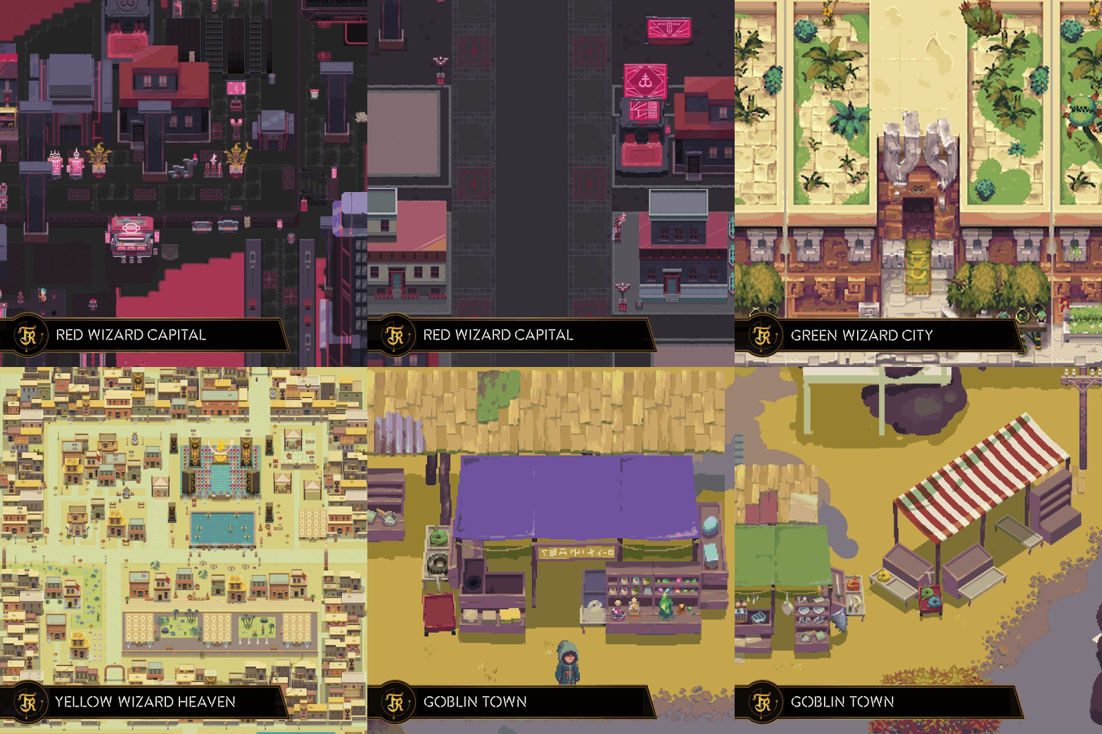
Over the last few months, a lot of work has gone into building and refining the Red Wizard Capital, the Yellow Wizard Haven, the Green Wizard City, Goblin Town and Alessar’s Keep. The goal is for each of these locations to have a distinct look and feel as you visit them and interact with their inhabitants.
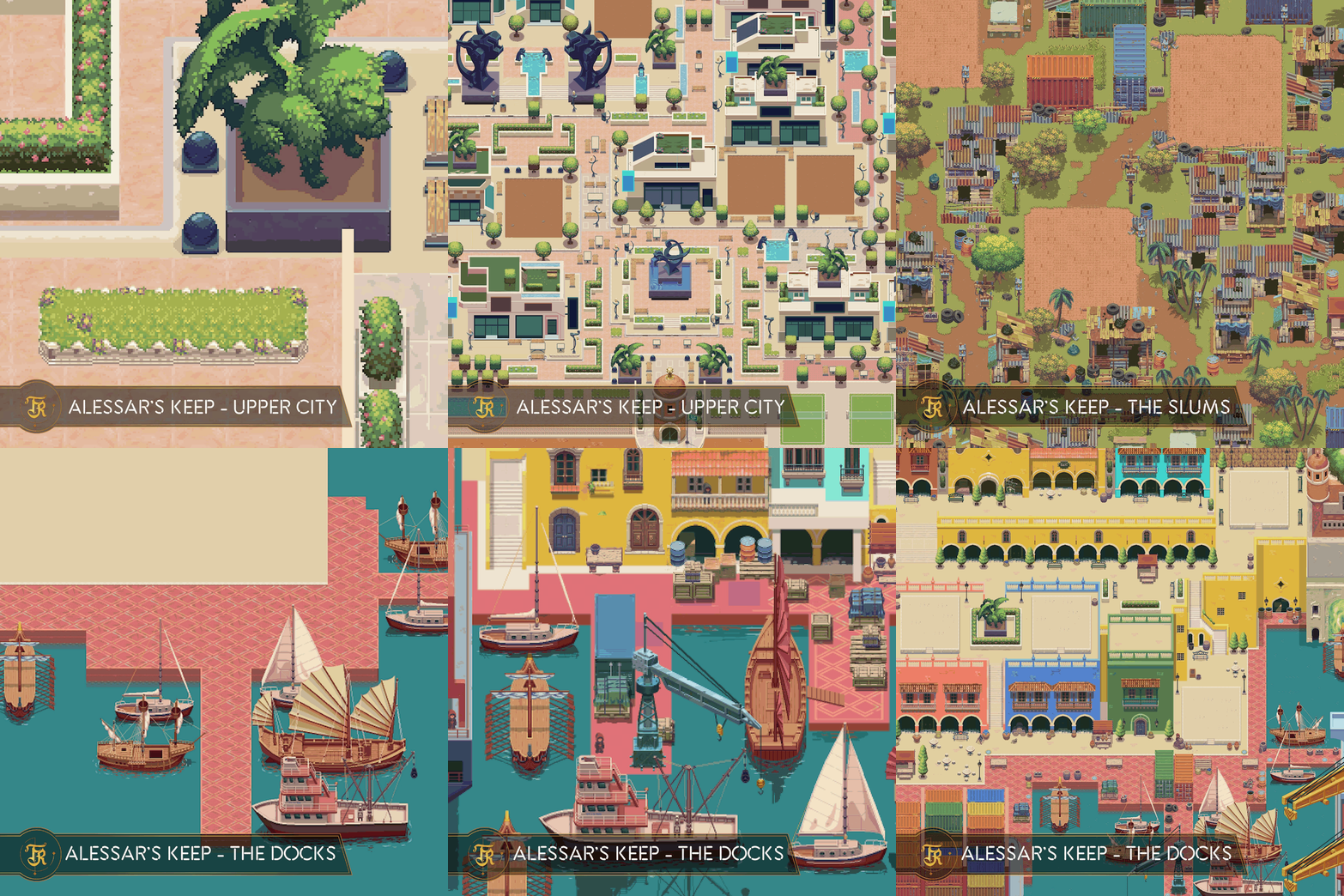
We’re especially excited about Alessar’s Keep as it’s a multi-tier city. The top level is a fancy high tech community where technology is pushed to its limits and residents wheel and deal with each other. The slums sit on a second, lower level and separate the hoi polloi from the high-tech upper crust of Alessar’s Keep’s inhabitants. Along the waterfront the docks bring in trade and commerce to the city. A series of portals allows the rich and famous access to the water and imported products without the need to traverse the crowded area of the slums. Below is a sneak peek at the work-in-progress city.
Battle Scenes
We’ve also been creating new exciting places for you to face off with enemies. To populate the battlegrounds of the world, we started by creating one battler setting for each region and are now expanding the set of scenes to include unique locations for each sub biome so the experience in them will feel more immersive. We’re also currently working on battle scenes for special locations of the world such as the Druid Circles and the Great Dump.
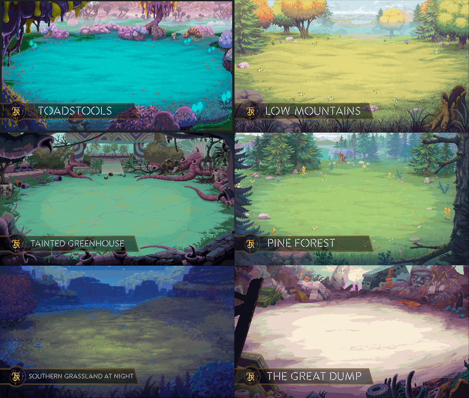
While you’ll be exploring the world from a top-down perspective, battle takes place with a side view to bring you closer to the action. This means each battle scene requires a re-imagining of a region and a new artistic perspective. We design them so that the scene’s lighting focuses your eye in the center where the action is while the outskirts of the image tend to be darker. The use of lighting and form lets our artists make the whole scene interesting, but keeps the actual battle as the primary part of the image.
To develop each region’s battle scenes, Level Design gives a couple of top-down screenshots of the area to the environment artists who then reimagine the region as a side-perspective battle scene complete with the appropriate props and decorations to tie it to the region.
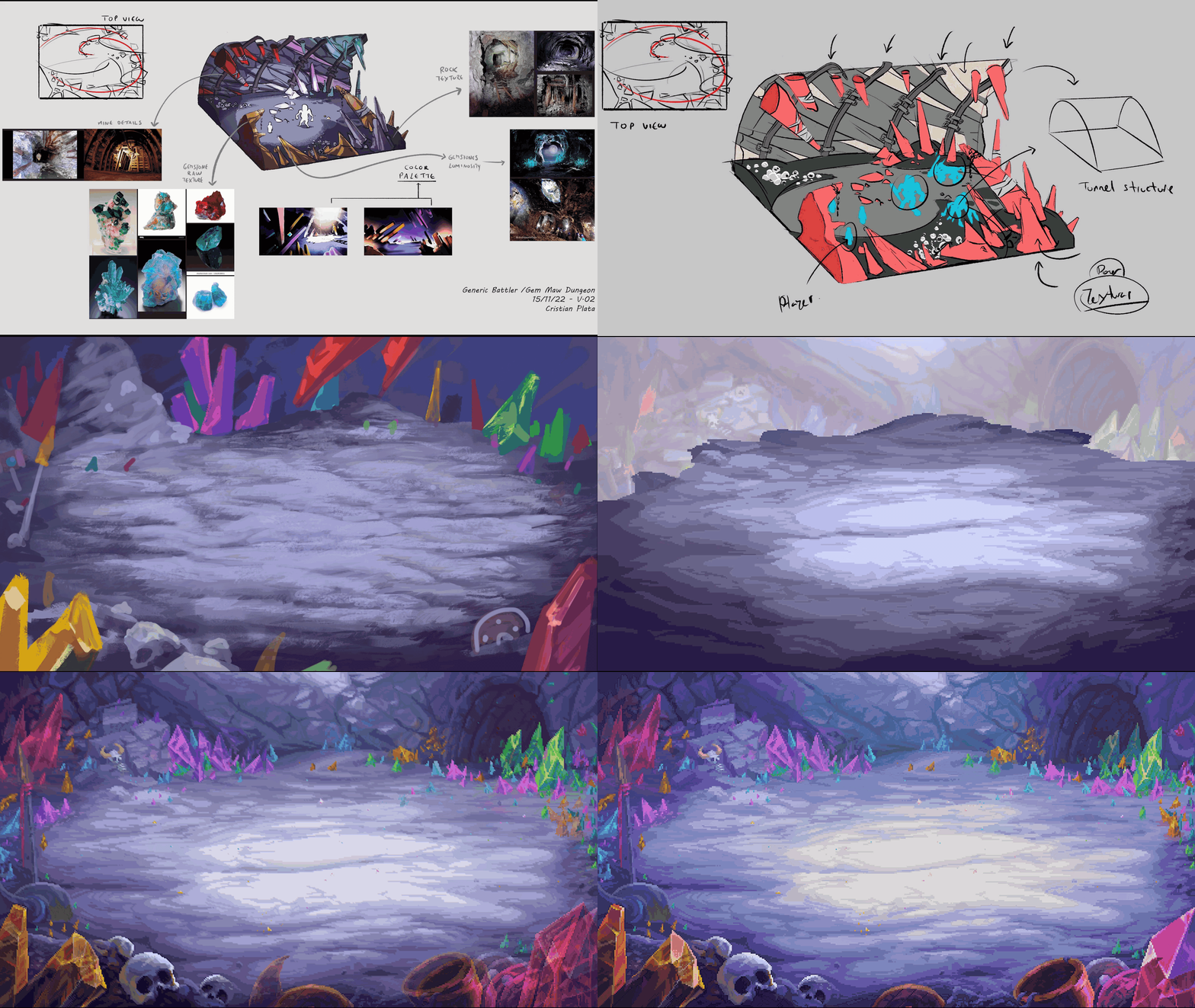
Dungeon Battle Scenes are made a little differently. There’s no dungeon ‘map’ for the player to run around, so instead of using the level design for reference, a concept artist uses game design’s description of the dungeon to produce a concept sketch that is then given to a pixel artist to convert into the finished battle scene.
City Neighborhoods
We’ve started to create different neighborhoods inside all of the various cities. Neighborhoods are areas within a city that feature unique layouts and a set of player plots to give players more control over the look and feel of a unique area in a city.
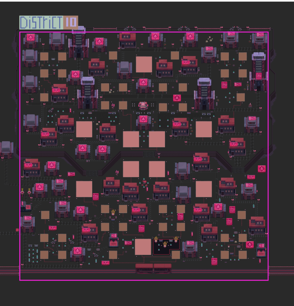
To create a proper sprawling metropolis and have it exist completely in the overall world map would simply take up too much space and force you to walk what would feel like miles to get anywhere. Our solution is to break up cities into neighborhoods to allow more content for you to experience and allow for different unique feels within the same overall city. Each Neighborhood within a city is instanced, allowing us to continue to add content to cities without necessarily needing to remove older content. This means cities are scalable for the needs of the game and players years down the line. There can exist ‘early game’ Neighborhoods with starter content right alongside late game Neighborhoods that allow fully kitted out Guilds access to new buildings and content.
We’re excited about the possibility of player-owned Neighborhoods where one Guild might decide to create an entirely unique experience for its members or for other players by the way they make use of their Plots.
Since we plan on the game having a long life-span, we know that cities will be as important five years from now as they are today. Having this variety, including in NPC areas (called districts), allows users to not have to go to the same places at level 2 as they would at level 40. We can continue to add new content and features using Neighborhoods which the team is very excited about.
Enemies
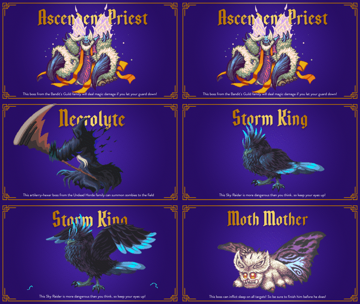
Enemies in the Runiverse come in enemy families. These families help to define enemy groups by similar characteristics. The team has produced seven enemy families so far, with more still in the works. The goal of these is to provide a cohesive world and give the art and design teams clear guidelines in producing content and encounters.
So far, each family has three standard enemies, two elite enemies, and one boss. Further down the line we’ll create more unique enemies that players might encounter.
Once a creature’s behavior, habitat, and abilities are written, it goes into art to design its concept. Based on the description and any pertinent changes that can be addressed during the design process.
This design is translated into pixel art and animated, starting with basics such as movement, idle, and taking damage. We give a description to the artist to provide the necessary information for the more complex animations, such as their abilities and effects.
VFXs for Status Effects
The visuals for status effects in combat are an important part of the game to get right. These effects need to clearly communicate some level of information to the player such as positive or negative effects, as well as give a visual cue about their impact – for example a slowing effect vs a damage over time effect.
Each Status Effect shows up as an animation on your character. In the example below, the exclamation point is Alert, the grey sparkling skin on the left side is Shield, and the purple on the top is Purge.

Here are a couple of the animations of Buffs:


Here are some animations for Debuff:


VFXs for Spell Effects
As one of the key pillars of the game, combat involves all areas of creative development. In combat spells are the main tool you will use to interact with your teammates and enemies.
Spells can be grouped together by type or effect and are derived from the specialties of the different Wizard factions in the Runiverse as well as the types of magic and enemies throughout the world.
With hundreds of spells planned for the game, the team has been hard at work the last few months producing final animations for both player and enemy spells some examples of which you can see below.
VFXs for enemies
Of course we can’t only show you the skills that the good guys will have! We have some really cool enemy animations coming together which may affect you or your team. We’ve created enemies that look really cool and based on where you encounter that enemy and what type of enemy it is we’ve come up with abilities that would match them.
Here’s a little look at what you’ll be up against in combat with enemy animations:

Interior Decorations
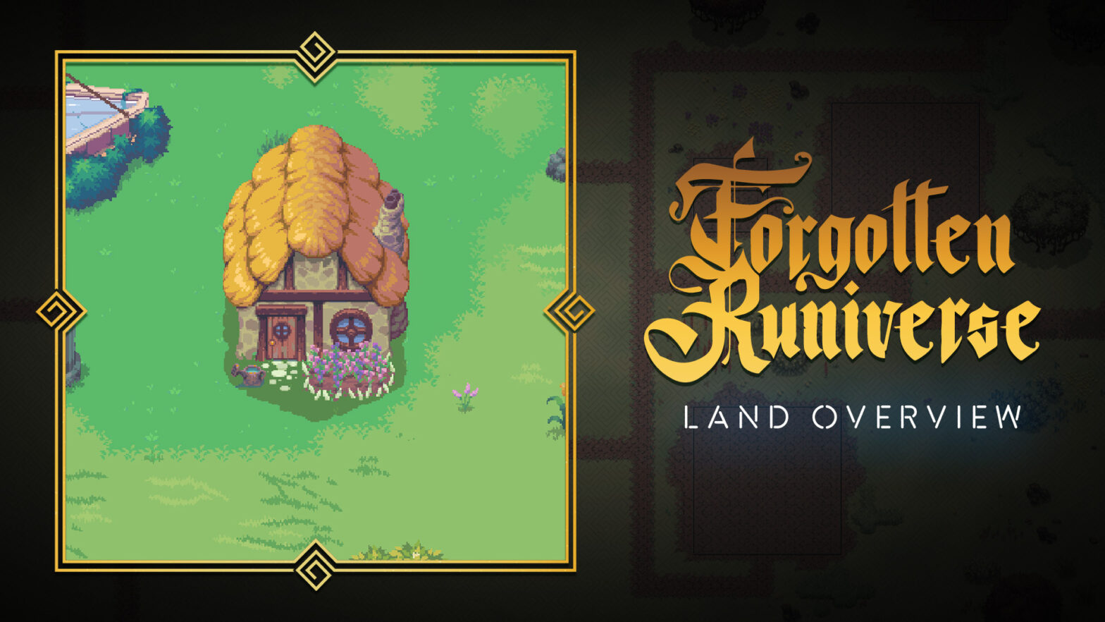
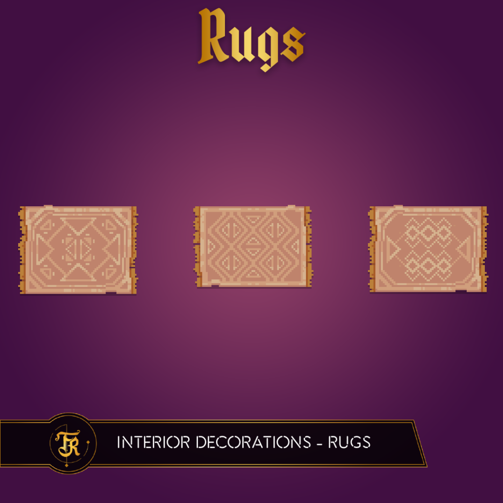
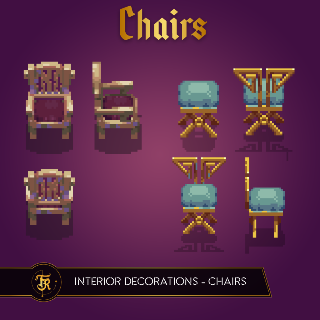
You’ll be able to not only own Land in the Runiverse, but also customize that land with a variety of buildings. Housing can be customized to fit your own taste. Of course, that means we have to build a system to allow you to place items, as well as create enough unique items that you’ll be able to feel like you’ve truly made your house a home.
Decorations work like weapons and equipment: you find a recipe for the decoration, you create the item, and depending on what materials you use the final product will have a different outcome.
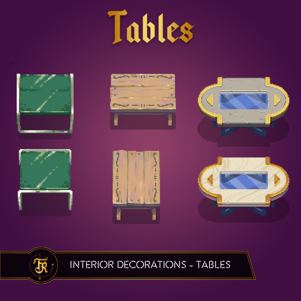
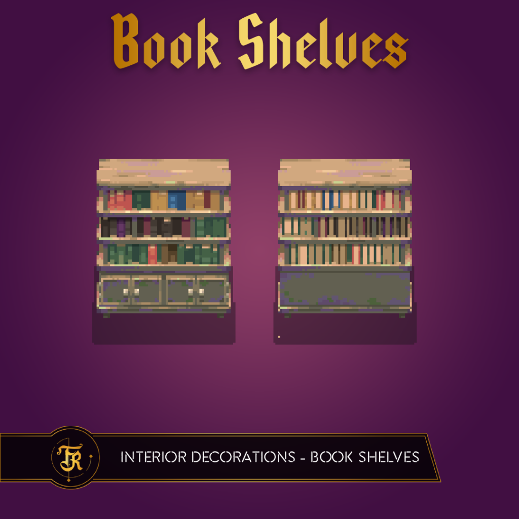
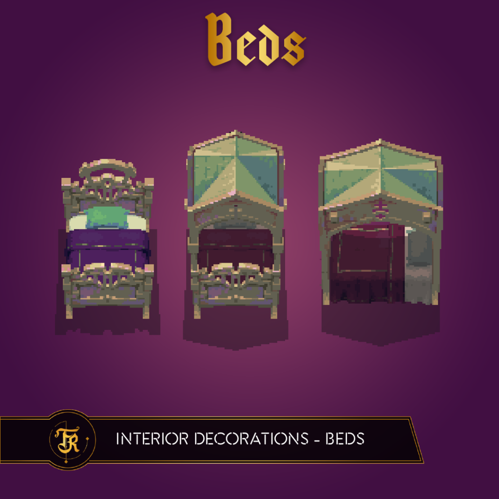
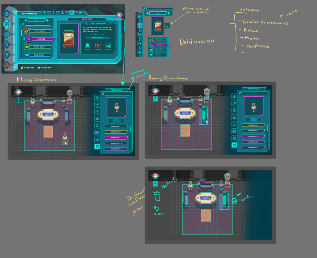
Decoration UI
One thing that can be hard to get right is allowing placement of items in an area during gameplay. It can seem really simple, but with all the variables of size, orientation, and player input controls, it gets complex quickly.
Dungeons UI
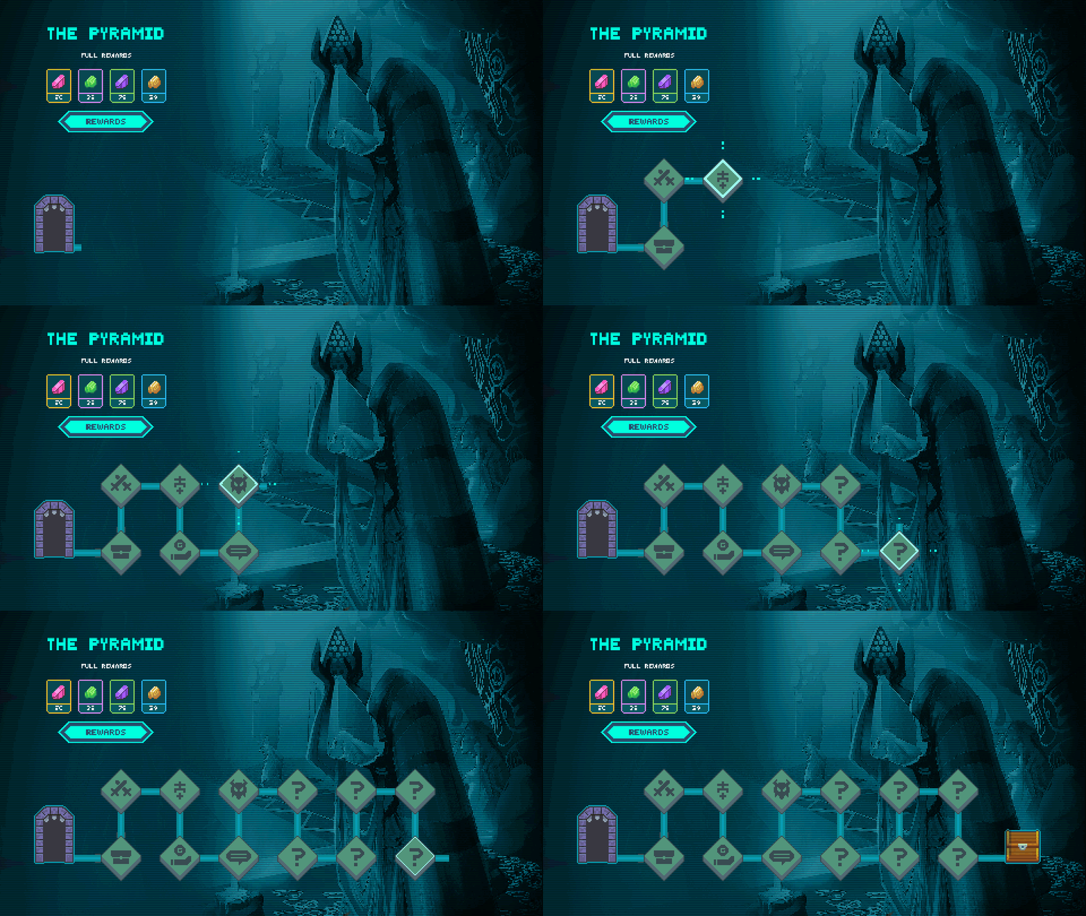
Dungeons are a homage to old school text-based adventure games but they also borrow from modern games like Slay the Spire – they are instanced experiences that will convey unique stories as you complete them. Along the way you’ll make choices alongside your teammates to determine which path to explore and which benefits you’ll earn.
There’s a lot of information that needs to be conveyed – from decision points and story elements to rewards and threats, so the art team’s been working on different screens for the UI. As you can see on the screenshots below, we’ve created screens for entering a dungeon, getting rewards, partying with other players (where players get to vote together on choices), and selecting a story path.
Dungeons are built on stories that are mainly conveyed through text and the decisions the player makes throughout the dungeon. This means the same dungeon can feel completely different by changing the text, enemy encounters and rewards fairly easily. Our hope is to use this modularity to bring in player stories and allow the community to contribute to the game and storytelling experience in the future.


When you enter a dungeon, you’ll select the story you want to experience (sometimes gated by level, quest, or difficulty). That story selection will have its own unique pathway through the dungeon comprised of a series of rooms holding story advancement, rewards, and enemies.
Design and Programming
Alpha UX Tests
In January, we published a private Alpha Build that had a first pass on implementation of the game’s major systems. We allowed a select group of partners to preview the build and give us feedback which has led to some great insights about the game’s flow and allowed our team to make a lot of iterative changes to those systems with the outside feedback.
Overall the feedback we received helped to validate a lot of our decisions and allowed us to test and update our assumptions to make sure the whitepaper and final product the team produces have solid foundations.
Since that build and tests, we’ve also had a significant portion of the team (now 40 strong!) focused on producing content to bring the world to life as we’ve shown above.
Collision Tests
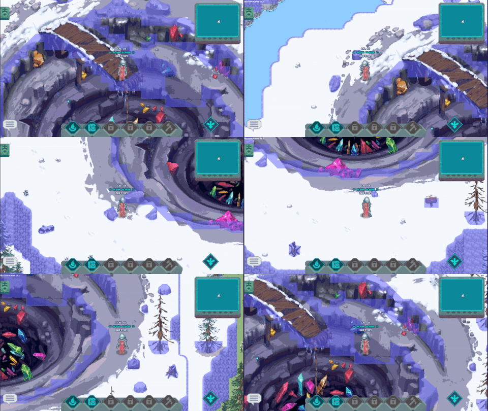
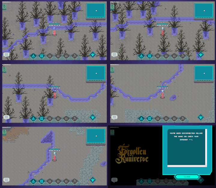
Part of the alpha testing we’ve been doing is making sure game collisions work properly. You can see in these videos that the collision layer is turned on to show which areas of the world and objects within it will block the user from traversing there. This is a helpful view for our QA testers to find bugs and places you could escape the intended play area, but also useful for the art team to understand how different decorations might impact the user’s traversal experience. We captured these as we were testing so nothing is complete quite yet.
Economy Simulation
Part of developing our whitepaper has been putting together a robust simulation of the game’s economy – from combat rewards to gathering of materials. We’ve been testing a variety of assumptions to make sure that our economy will be resilient as well as to give us baseline goals and expectations to measure against as we move forward into real-life tests of the economy’s balance.
Here’s a look at what some of those simulations look like behind the scenes. There are a lot of variables that feed into the game’s macro and micro economy, so things can certainly get a little complex.
Whitepaper
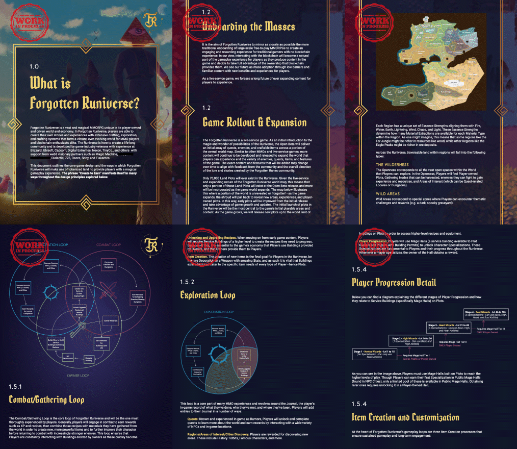
We’ll be officially unveiling our whitepaper soon. The whitepaper is a large, directional document to lay out our vision/plans for much of the game. As we iterate, some details will inevitably change, but we want to share with the community what we’re planning for at the moment. We’ll be releasing the entire thing soon, but for now here’s a little teaser of a few of the pages.
We are excited to continue moving toward the finish line and sharing our progress with all of you! Make sure to hop into Discord or follow us on Twitter to discuss all the updates!


